Prioritise mobility measures that
actually cut emissions
Understand local travel patterns – and where real change is possible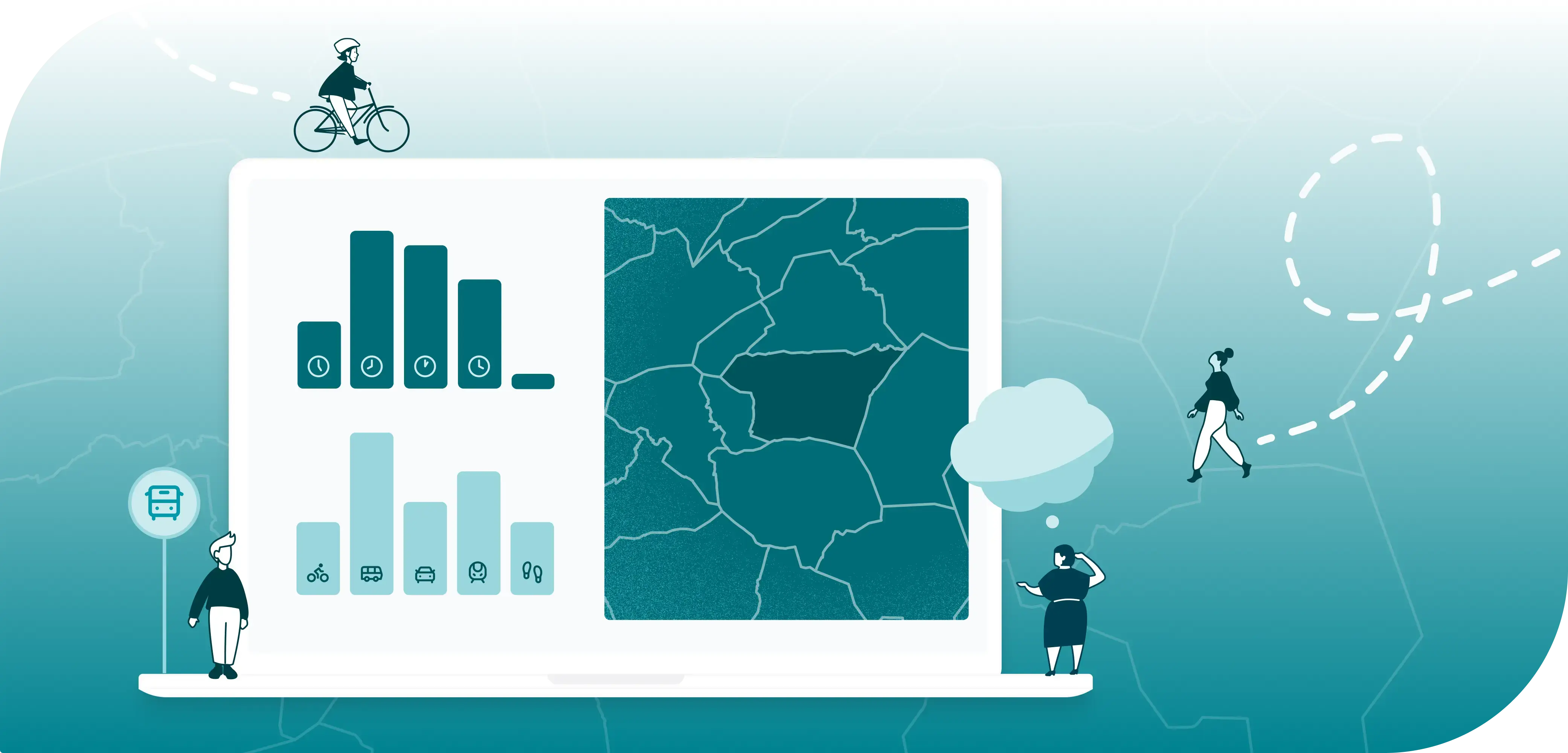
You’re carrying a big responsibility. You want to reduce emissions from transport and travel – but too often, decisions are made without enough insight.
Maybe you’ve already heard the question:
“Will this measure actually work? Will it reduce emissions?”

You’re already doing your best – with travel surveys, manual counts, and maybe a few assumptions. But still, it can feel uncertain. Without a clear overview, it’s hard to prioritise. Hard to get support. And even harder to prove what’s actually working.

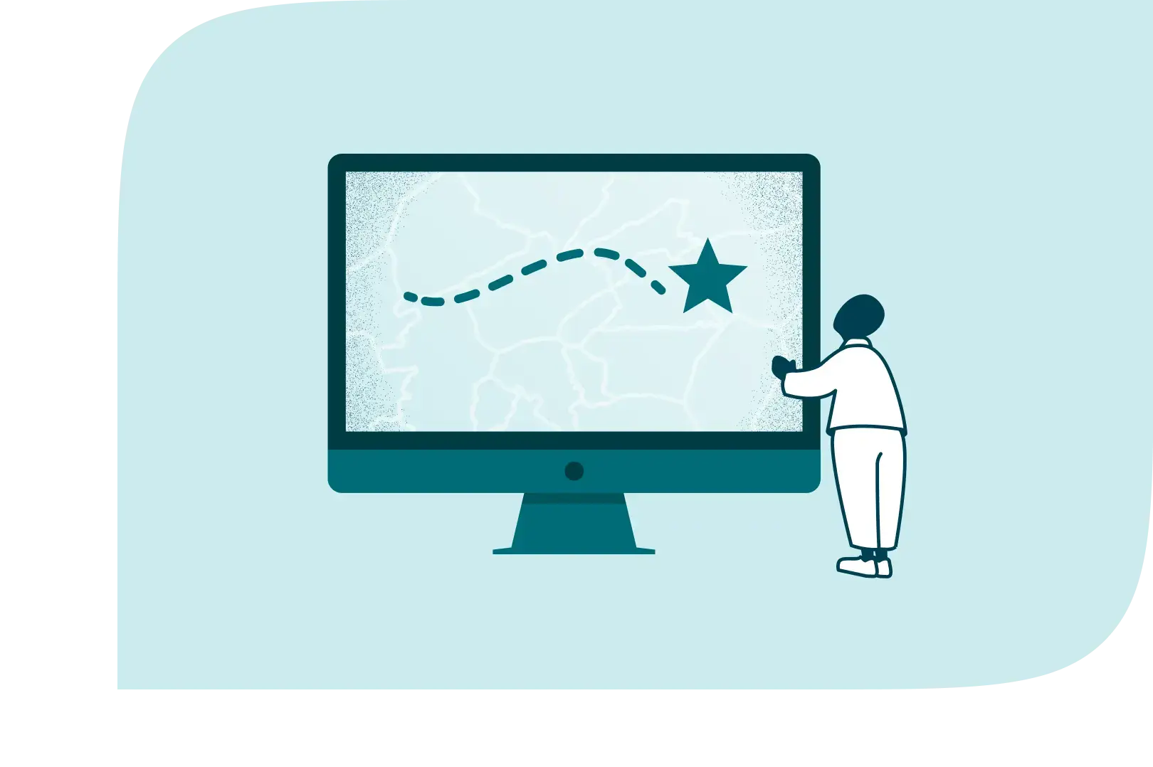
When you understand how people actually move, you gain the insight you need to make better decisions. Spot trends and travel patterns in and out of specific areas – and use the data to identify where change can happen.
An intuitive dashboard gives you a clear view, month by month – so you can base your actions on up-to-date data, not assumptions.

This tool is the result of a unique collaboration between Telia, Geodata, It’s Tomorrow and Ducky.
We’ve brought together the best of several worlds – mobility data, visualisation, climate insight and user-friendly tech – to give you everything you need to plan, prioritise, and document the measures that actually make a difference.
.png)

.webp)
Sometimes, gut feeling just isn’t enough. With monthly travel data at your fingertips, you’ll see how people actually move around in a specific area – when, where, and how their habits change over time.
We combine aggregated, anonymous mobile data from Telia with other sources to map up to 40% of people’s travel habits – all fully anonymised.Each month, you get fresh data showing travel flows, transport choices, and how they shift over time – visualised in a map-based dashboard from Geodata.You can filter by area, travel mode and more – and combine the data with demographics, walking distance to public transport, and other useful indicators.That way, you’ll have a solid, up-to-date knowledge base to support planning, reporting and working with others.
Will your measure actually have an impact? With regularly updated data showing travel patterns over time, you can test ideas on a small scale before rolling them out more widely. That means saving time and money – and making more confident decisions based on real results.
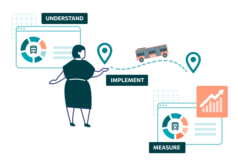
You can compare mobility data from before and after a measure is introduced – and see whether travel patterns have actually changed. Has car traffic into the city centre dropped after new parking regulations? Are more people cycling since the new infrastructure was added? With monthly updates and clear visualisations, you’ll see the results in black and white – and have stronger arguments for continuing or scaling up. You’ll gain better support, reduce risks, and feel more confident every step of the way – because you have real, up-to-date data behind you. Test-based mobility planning also helps different teams work towards shared goals. By changing travel habits, we can improve public health, reduce emissions, free up space, and create more liveable places to live and work.
Shifting to greener mobility and climate-friendly travel habits is key to meeting national climate goals. But time is short – and so is your budget.By integrating mobility data into map-based tools like Geodata, you get the overview you need to prioritise, align and take action where it matters most.
With monthly updates in Geodata, you’ll spot the areas with the biggest potential. Are there lots of short car trips in and out of the city centre? Is there a viable alternative to driving in a specific area? Have past measures made the impact you hoped for? With this insight, you can act where it counts – and get the best return on your efforts. No more manual counts or scattered snapshots. Get one shared, ongoing view of what’s really happening – all in one tool, visualised, anonymised and ready to use.